7 Things You Should Avoid in Your E-Commerce Site Search
Written by Alok Patel

In the present e-commerce market, on-site search is one of the most important, yet most overlooked features for any online store. The e-commerce site search enables your users to enter search query and retrieve results about your products and services. The better your site search, the easier for the customers to find information they are seeking.
Today, nobody has time to browse the whole website to find the products they are looking for. That is the reason users turn to search function to search the exact products they want. If people cannot find what they are looking for, they cannot buy them. Therefore, it becomes imperative to have an efficient site search engine, such as Wizzy that provides seamless shopping experience and convert more visitors into customers.
However, having an efficient e-commerce site search alone is not enough. You need to pay attention to certain design tweaks that help you make the most of your search system. In this post, we have compiled a list of certain practices that you should avoid in order to boost your site search performance.
Common Pitfalls in E-Commerce Site Search and How to Avoid Them
1. Avoid Scrolling in Autocomplete Interface

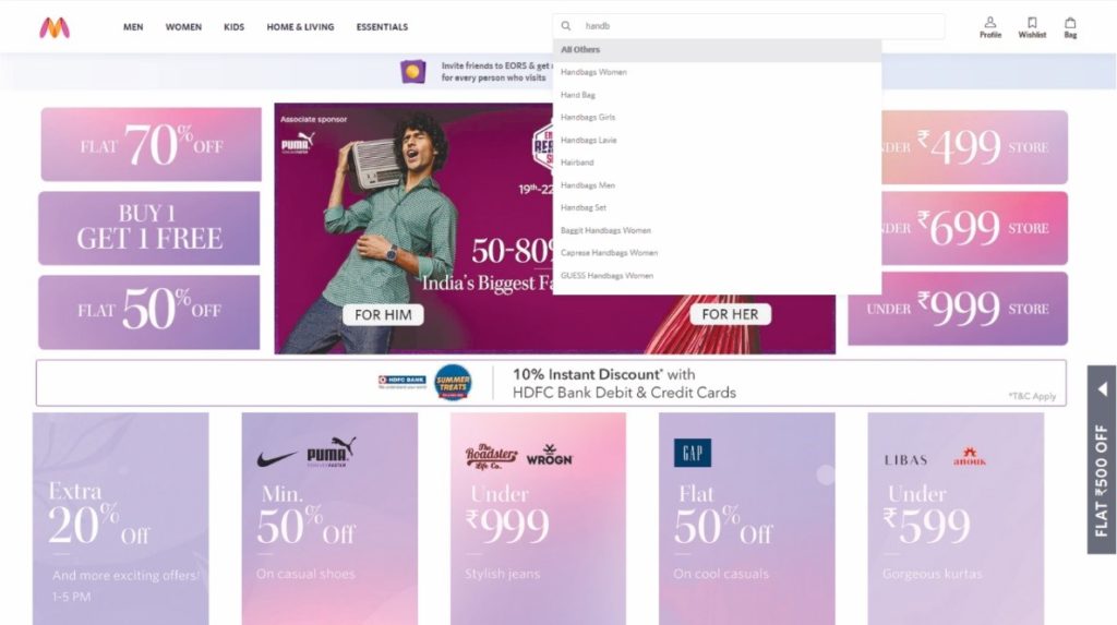
Sometimes the number of suggestions may exceed the fixed size of the interface and the results are shown in the scrollbar. Inline scrolling often lead customers to make unintentional clicks, obscure content and scroll-jacking. Having a separate scroll area inside an interactive interface should be avoided in order to prevent interaction issues.
Hence, allow the size of the widget to expand naturally without scrolling, so your shoppers can focus on the results rather than struggling with inline scrolling. In addition, avoid endless scrolling of the results page as it may hinder the users’ ability to get an easy overview of the product of their interest.
2. Remove Competing Visual Elements from Surrounding

Since site search is the crucial part of any e-commerce store, make sure there are no other distracting elements around, especially in your mobile version of the site. Elements adjacent or encroached on site search may prevent the users from seeing auto suggestions.
Moreover, bear in mind that for mobile users it is very challenging as the suggestions are often sandwiched between the search box and the mobile keyboard. Reducing the usage of distracting elements can help your visitors focus on auto-suggestions and move more smoothly through the product discovery and shopping process.
3. Never Place Search Box where it is Difficult to Spot
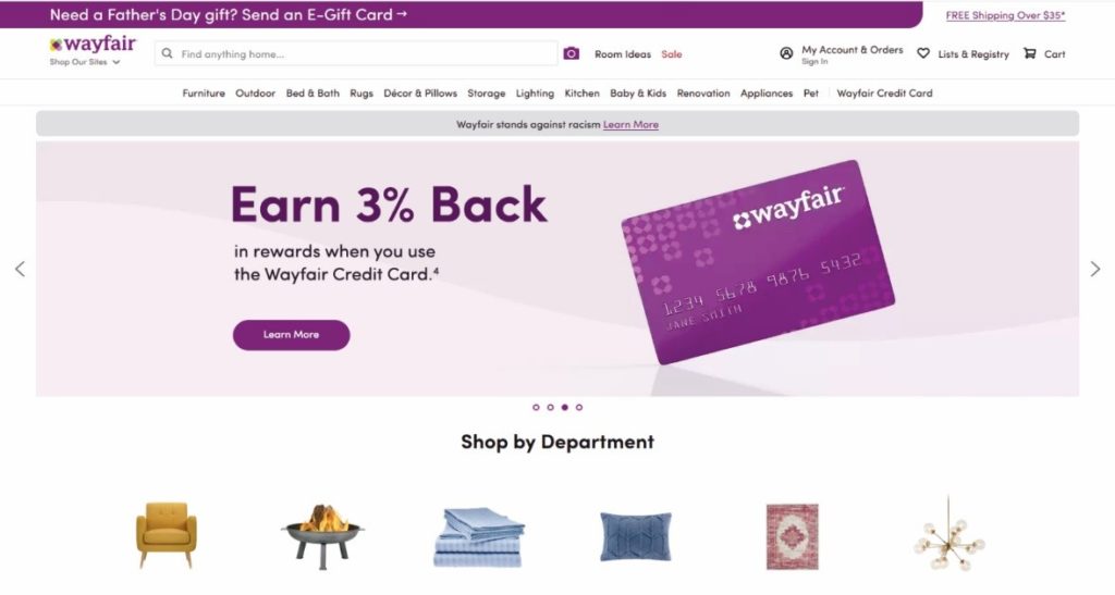
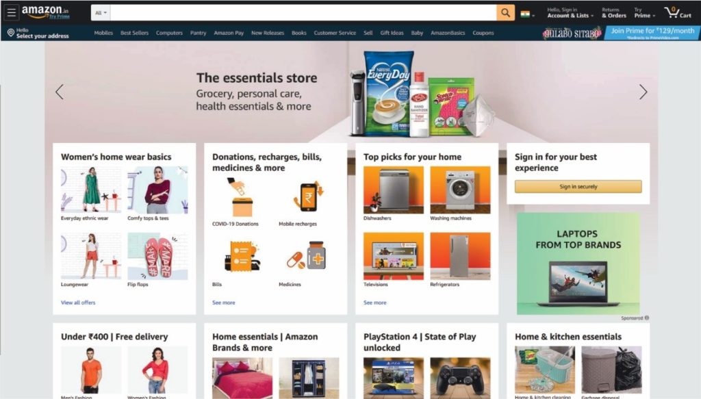
For a content heavy website, it is necessary to have a clear, distinctive site search to ensure your visitors are able to notice it and use it. Whenever we visit a fairly complex site, we always look for the search bar to find our desired products.
So, take this idea into consideration and pay utmost attention to where to put your search bar while designing your site. It is very essential for e-commerce owners to place the site search in the area with maximum visibility, so your visitors can use it whenever they want to.
4. Don’t Make Search Box too Small

The size of the search box may vary from site to site based on the types of products retailers stock, but it is necessary that search boxes should be big enough to fit most user queries. Shorter text boxes tend to force users to enter short queries, and if the search requires long phrases, then it makes it difficult for them to detect spelling mistakes and correct them.
An ideal search box would easily fit 27 characters, so we would advise you to apply the same rule. A big search box that can accommodate any query is important, especially for retailers that have a wide range of products as it allows users to enter, edit or delete specific terms in the search bar.
5. Never Let your Search Show ‘No Results Found’
It is very common for people to search products or brands that you don’t stock. Ideally, your store has no results to show for that exact query, but why show no results page? Instead, you can show related products or brands that they might be interested in.
For example, if your user search ‘blue shirt’, but your store doesn’t have that particular item, you can recommend other color shirts or blue color T-shirts or tank tops rather than showing ‘no results page’ that may act as a barrier in their navigation. You can also suggest them other similar brands, but never come up with ‘nothing found’ message.
6. Reduce Visual Disturbance within the Search
Showing auto suggestions along with images is good, but you need to be careful that you don’t go overboard. You may get overwhelmed with the site search feature and add trending searches and best-selling products that may visual overpower your search engine.
This distracts users from searching products they want and they may also tend to forget why they are here in the first place. Therefore, why not opt for a simple and clean site search design that is fully dedicated to showing word suggestions? Removing extra content helps users focus on commencing exploration of the products.
7. Don’t Neglect the Significance of Metadata
Metadata like title, tags and descriptions also play an equally important role in improving your site search performance. Therefore, by no means you should overlook their importance. Make sure you include all the search terms that are being used the most by your users in the metadata.
With tools like Google Analytics, you can draw much of the insight on what terms are being searched the most. You can also make use of good keyword tools to figure out the same.
Enhancing User Experience by Avoiding Site Search Mistakes
Site search is one of the solid pillars of well-designed e-commerce store. Your visitors already have a clear understanding of what product they want to purchase, so your job is to remove all the obstacles and paving the way to a successful purchase.
Encourage your customers to utilize the on-site search that has all the features to deliver a seamless shopping experience. By following the above mentioned practices you are guaranteed to achieve your goals and drive more sales.
Share this article
Help others discover this content
