7 Tips To Enhance The User Search Experience For Your eCommerce Store
Written by Alok Patel

Every eCommerce website has two types of visitors: browsers and shoppers. This visitor is stuck in the middle of the sales funnel. This user has only just learned about your site and is browsing it casually. This user is in the exploration stage, where he will look through all of the products on your website. The searchers are the second group. These visitors are well-versed in your products and services, and they have a specific search goal in mind. This means that visitors are more likely to buy something.
Now, let’s look at some statistics that show search users are more likely to convert than browsers. Statistics show that search users are 7-10 times more likely to convert. Wizzy data shows that search users are 12x more effective. The eCommerce store has between 40 and 60% search users. So it has a sizable user base. It is always best to keep your searchers satisfied. This blog will explain what an eCommerce site search solution is. Also included are seven suggestions for improving the search experience for eCommerce stores.
What is An eCommerce Site Search Solution?
An eCommerce site search solution is a search engine that comes preinstalled or integrated with your website. Where your customers can search for the products they want by matching keywords with products in your store. The term “search solution” refers not only to the search bar, but also to the specific demographic available within the search bar. Colour, size, brand, material, and so on are all examples of demographics. The more specific the search bar, the more likely your customers will convert into potential buyers.
A specific search bar allows your users to filter out unnecessary items while browsing through the available products. An eCommerce search bar’s main features are filtering and sorting. Let’s take a closer look at how you can improve your users’ search experience for your eCommerce store.
1. Make your search bar easy to spot

Having a complicated site with a large number of products on your eCommerce store. Users are looking for a way to navigate your website, and a good search bar will help them. It is best to keep your search bar position visible while designing your website. Always conduct research on the site experience before deciding where to place the search bar on your eCommerce store.
Let’s talk about some basic practices where you can design your search bar:
- Give your search bar an extra space, don’t bind them with any other buttons.
- Use a magnifying glass icon because it is the universal symbol for the search bar and it’s a common practice done by all the eCommerce sites.
- If you don’t prefer a magnifying glass icon you should opt for a GO button in the search bar.
- Please make sure that beside the search icon there is a blank bar for writing the keywords.
- Some users prefer the enter button and some the search button. It is advisable to keep multiple button options.
- Design your search bar in the centre of your site or on the right side of your website. These are conventional locations where the search bar is kept on the majority of the sites.
2. Place a text search that encourages users to search

Simply positioning your search bar in the proper location will not suffice. You must include search text that encourages your users to search. It is also advisable to ensure that the search text cleans away as the user types the keyword. Never make your users delete the search text on their own; this is very inconvenient. You can enter search terms such as product name, brand, category, product code, and so on. There are numerous things you can write in the search text; these are just a few examples.
You can also write a good quote to entice your customers to search for you.
3. Place your search box on every page

Your visitors are constantly looking for a point of departure from which they can search for the desired item. It will be easier to navigate the search experience if there is a search bar on every page. We recommend keeping your search bar at the top of all of your pages. Alternatively, you can conduct research on the pavement by examining where your top competitors’ searches are directed and then make a decision.
It is not recommended to keep your search bar on the checkout page because it will disrupt the entire purchasing process.

4. Search Query Autocomplete

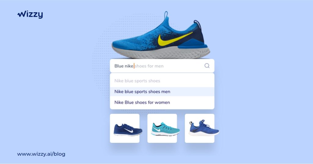
When you search on Google, you will always get search suggestions and the option to auto-complete your search query. This feature astounds you because it’s incredible that the search engine understands what you’re looking for. The search query should be auto completed by your search engine. You can use a smart search tool like Wizzy, which is based on AI and has an auto-suggestion feature.
Sometimes your users will search in their regional language, such as Kurti, which is a Hindi word for the dress. Wizzy supports multiple languages, so you will never lose a potential customer.
5. Allow users to search within the departments

Searching within your eCommerce store’s departments narrows your users’ search perspective. Let me illustrate this strategy with an example. When your user searches in the shirts section, it is obvious that the user is looking for a variety of shirts. If a user types Louis Philippe into the search box. The search engine should then only show them shirts from the Louis Philippe brand. The search query makes no sense if pants and socks are included in the search results because the user is specifically looking for Louis Philippe shirts.
Your search bar tool should recognize which department of your website the user is searching from and display search results accordingly.
6. Quick integration of search bar tool

Some search tools will take months to optimize the search queries. There is an issue with search bar tools in that if you feed information into their system, it will adapt and display the search results. Let us use an example to better understand this strategy: you added the pent in the search result information, but the correct spelling is pants. As a result, when a user searches for pants, the search query will contain an error because the information entered into the system is incorrect.
Well, you could have avoided this situation if you had used a smart AI search bar plugin tool like Wizzy, which has already made a set of information available and the AI feature automatically corrects complex spellings.

7. Natural language processing in the search results

Users’ search queries have evolved over time, and big companies like Facebook, Apple, and Amazon are aware of this. What if a search bar understands your language and how you discuss the product you want to buy with your friends and family? Well, this saves time and effort while shopping. For example, suppose you search a query in NLP for men’s shirts in size m for under 700 and the user receives the exact list of products that they are looking for. This feature makes this product extremely comfortable and convenient.
Summary
So you now understand why having a good search experience on your eCommerce store is so important. A good search bar experience simplifies many things, and you can convert many customers into potential buyers simply by displaying the perfect results that they are looking for.
Share this article
Help others discover this content
