With a growing number of products, it has become a real challenge for e-commerce owners to manage their inventory and guide customers to the product they are looking for with convenience and in the quickest way possible. Although intuitive e-commerce site search solution can deliver relevant results, but faceted navigation further helps e-commerce owners improve their product search experience. Often, prospects are unsure about what they want to buy, and they wish to explore options before completing the purchase.
Facet search simplifies the entire process by allowing users to narrow down the results easily and quickly. Almost all leading e-commerce sites today implement faceted navigation. Efficient facet search ensures that your users don’t get lost in their search. Thus, faceted navigation plays a significant role in improving the usability and user experience.
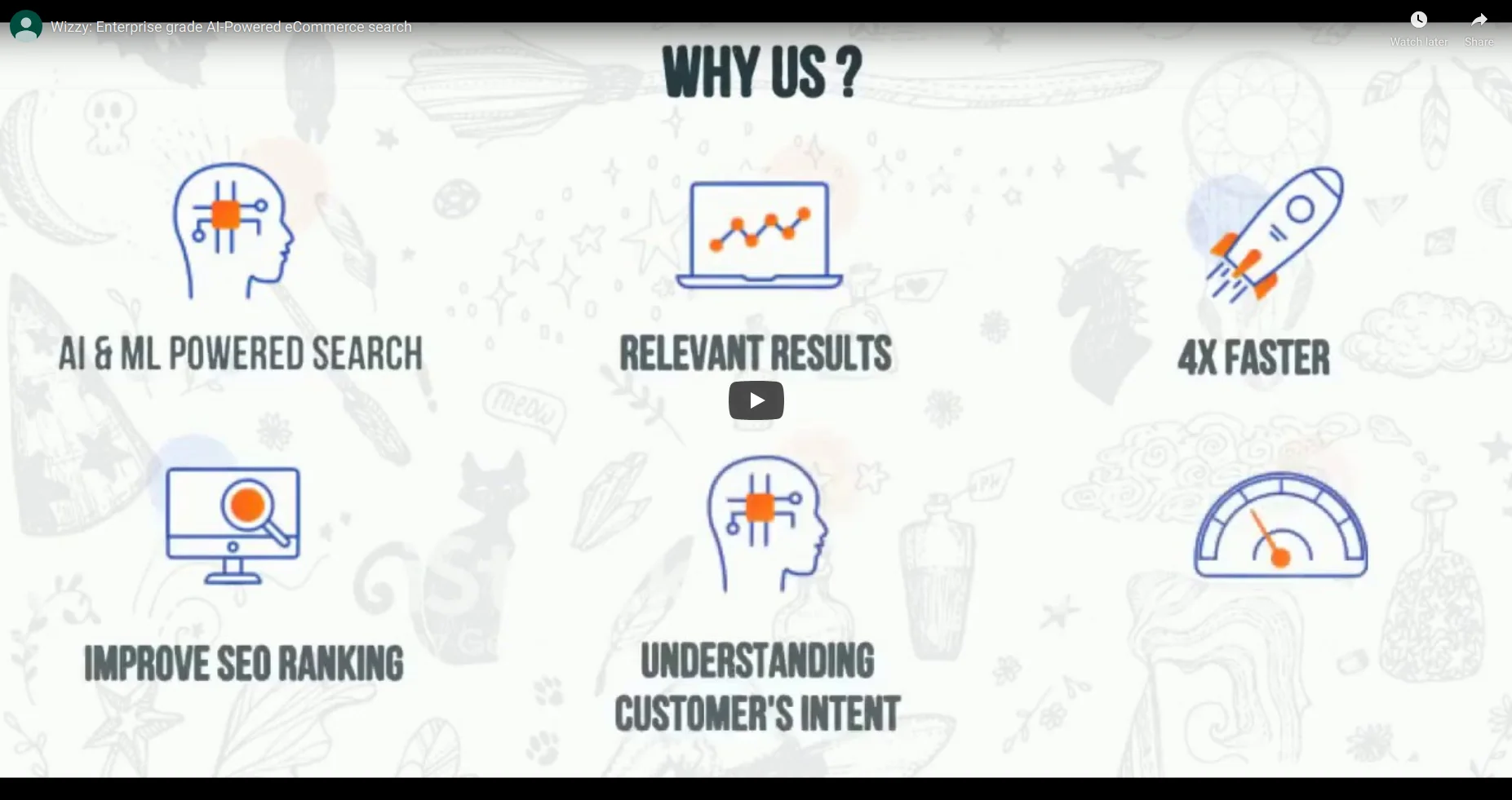
As we already learned about what is faceted navigation and how it can benefit your e-commerce site in the previous blog post, now we will learn about some best practices for faceted search navigation. These tips and tricks will help you design your faceted search in the most efficient way that will certainly boost your e-commerce sales.
#1 Use Relevant Options
The facets, and the options included in the facets should be selected relevant to the category. For instance, if a customer is looking for mobile phones, the appropriate facets should be the brand, price range, operating system, RAM and storage. Provide them with all the possible choices specific to the category. In order to determine which facets and filter options suit the best, you can view your competitors site and industry-leading brands.
Also, listen to your customers. The best way to find out is examine your logs for commonly used keywords, customer reviews, and even the message that your visitor leaves to your support and sales team. This will give you an idea about the search criteria of your target audience.
#2 Allow Multi-Selection

It is usually a good practice to allow users to select multiple options within a single facet, so they can see a vast range of products. For example, if a customer is looking to buy a refrigerator, allowing them to choose different brand options can help them shortlist products, and they can choose one based on capacity and price. These combinations of facets will help your users in decision-making.
When you allow users to make multiple selection, they can create a personalized search based on their particular criteria. This enables them to find the most relevant items available and choose the one that matches their requirements, which greatly improve their browsing experience.
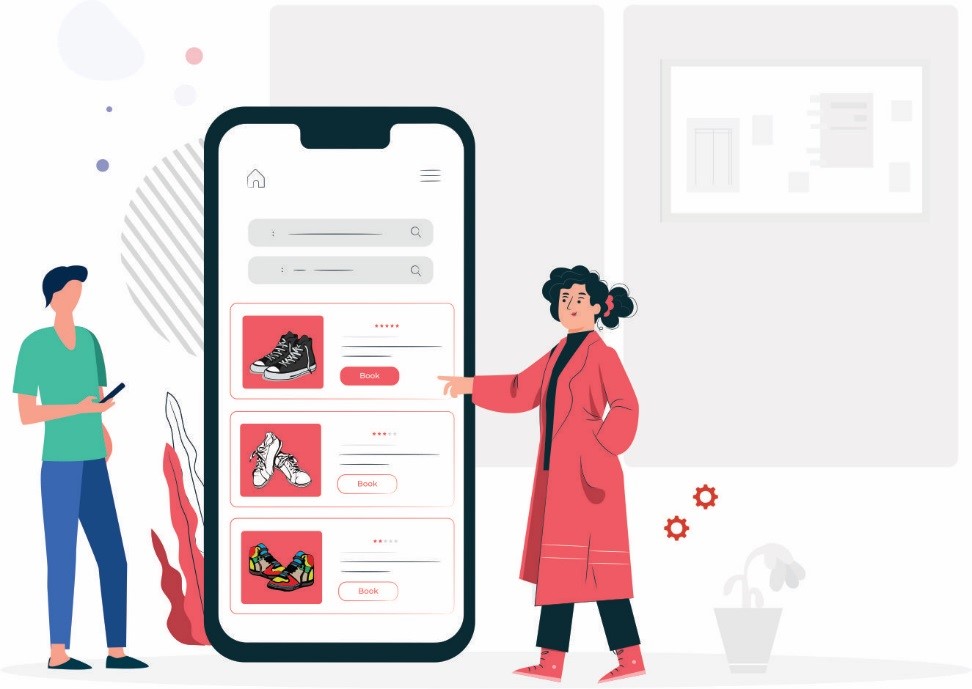
#3 Avoid Filter Options that Return No Results
Users feel frustrated when they see no results found page. It is a very disappointing experience for a user to select multiple options just to discover that there are not matching the results. While there are plenty of ways to optimize your ‘no results’ page, but one good way to do is displaying only available options. Inform them that the products they are looking for are not available at the moment, through the filters.
For instance, when users select ‘blue’ as their shirt color, then display only the available sizes. Gray out the rest of the sizes that are not available in blue color, so users won’t be able to select them. This will reduce the instances of customers landing to the no-results page.
#4 Show Only Necessary Facets and Clear Choices

While a couple of facets may not be enough to narrow down the search results, too many facets can confuse your users. Hence, an efficient way is to keep only necessary filters and create a group of facets that can be expanded or collapsed. For example, if a customer is not concerned about price or brand, he can just move to shirts type and pattern without scrolling down to find his desired facets.
Moreover, make sure the options you provide are not confusing as well. Break down large categories into sub categories and offer clarity of choices because the purpose of faceted search is to make things easier for your users. For instance, the men’s shoes category can have different options like boots, slip-ons, sneakers and accessories. The whole idea about this practice is to keep things minimum and precise, so your visitors can find and use the facets conveniently.
#5 Position Facets Vertically
The best place to keep facets is on the left side and in vertical position. Horizontal navigation provides a better view of options, but it is only appropriate when the number of products and their attributes are not too many. Presenting a large number of facets horizontally may make your site look cluttered. It will also hamper the user experience as the facets would disappear as the users scroll down. Users have to scroll up & down in order to use it.
When there are too many items, vertical arrangements work the best and therefore it is the most common amongst many e-commerce owners. Since humans are accustomed to reading from left to right, placing facets on the left side will get their attention immediately even before discovering the products. Customers can conveniently find facets, enabling them to find products and complete their purchase faster.
#6 List Down Options Logically
There are numerous ways you can sort choices within a facet. You can sort alphabetically, popularity, highly recommended or unit count. Generally price and size facets are arranged in the ascending order, while user ratings are sorted in descending order – 5 stars being at the top and 1 star being at the bottom.
A book store having categories as its facet may have values sorted alphabetically, from Art being at the top, followed by Bibliography and so forth. Likewise, the ‘recently launched’ facet is sorted in the ascending order, with the latest releases at the top.
#7 Use Diverse Types of Facets
Knowing what types of facets to use, from sliders, links, drop downs, checkboxes and pop-ups, are crucial. Links are the most popular option to display categories and major product attributes. For price range and customer ratings, an adjustable slider works the best, as it allows users to gradually increase the range until their preferred value is reached. When you want to create a combination of different options, like you need shirts of both medium and large sizes, you can choose checkboxes. If product attributes are mutually exclusive, you can use drop downs and radio buttons.
Remember that one size doesn’t fit all. Using radio buttons and checkboxes in price range may not be as convenient as sliders. For instance, if you are using radio buttons with 1-100, 101-200 and so on, and your customer selects 101-200, but he wants to see results from 1-200. While using checkboxes, make sure the entire area of the value is clickable, including the text, so users don’t have to struggle with clicking on a tiny box.
#8 Display Selected Facets and Filters
While using facet navigation, users may forget what filters they have used and then they have to go through all the facets in order to see what they have selected. This can be often time-consuming when the users have selected too many options. Therefore, display all the selected filters, so users can modify them without having to scour all the filters. This can be done in several ways, such as inline, the breadcrumb trail and a breadbox.
With the inline approach, the selected value is displayed within the facet itself, but at the top of all other unselected values. In breadcrumb trail, the selected filters are shown at the top of search results. As the user continues selecting filters, they are added to the trail. This list is accompanied by ‘x’ icon, so users can remove the selection directly from the trail. The breadbox method displays all the selected values in a dedicated box, often located on the top of all the facets.
#9 Use Words that Your Customers Understand
Many online stores fall into the trap of using their own made-up names for the filters. You may have thought about a creative name to label your facets, but your customers may not understand your creativity. If they know your creative words, then they can find products with a simple search query. Hence, always strive to help your potential customers find what they are looking rather than showing your creative side.
Use words and terms that your customers understand and are the most familiar with. Take a look what phrases your customers are using to make a search. You can also check their reviews or talk to your sales team to get an insight on what words do they use. Doing this will not only help you create useful filters, but also allows you to label filters in the most comprehensive way.
#10 Refine Results Immediately
The speed at which the results are refined when users apply filters matter a lot. As customers continue selecting their preferred choices, the results should be refined immediately. Based on a study, most prospects expect the site to load within 2 seconds. If the site takes more than 2 seconds to load, around 40% of all users abandon the site. Another study states that conversions are optimum if the refresh rate is 2 seconds, and there is a drop of 6.7% in conversion rates for every second of delay.
The best way to increase your page refresh rate is by integrating AJAX technology. Every time the customer selects the values, the entire page is not refreshed, but only selected data is fetched, which tremendously reduces processing time.
Thus, it is very essential to carefully understand and plan these practices in order to avoid any issues while implementing faceted navigation.