Optimizing E-Commerce Mobile Search Functionality to Boost User Experience and Conversions
Written by Alok Patel
We’ve come a long way in the on-site and in-app searches and have made huge strides in understanding how users interact with our products. But there is still more to learn.
Search is an integral part of the user experience for any e-commerce site or app and is critical to helping users find what they are looking for quickly and effortlessly. However, on-site or in-app searches can be challenging to get right. Many factors can impact whether a user finds what they are looking for:
● Keyword matching – How well does the search engine match what the user types into the search bar? Does it focus on exact keyword matches or broader matches?
● Personalization – Does the search engine remember your previous searches? Are there filters that allow you to narrow down your results?
● Selection – How many results do a search return? How many are relevant to what I am searching for?
Smartphones have become the convenient choice to shop online for 56% of the consumers, while 45% are shopping all the time through their mobile phones. In comparison, people who use desktops for shopping have reduced to 28% while only 16% use their tablets.
But even with many e-commerce businesses focussing heavily on optimizing their mobile search experience — and with the traffic to sites from mobile searches increasing rapidly — the conversions remain bleak. The conversion rates for e-commerce sites from desktops are at 3.82%, while the mobile site or app conversions are at 1.32%.
This shows us that even with consumers preferring to shop through mobile phones, the shopping experience isn’t as favorable as they expect. This is often due to the differences in navigating through a mobile phone than a desktop.

Why Navigation Is Different On Desktop vs Mobile
Search is a big part of the user experience, so creating a great mobile search experience is just as crucial as creating any other part of your site or app. With 64% of people using mobile devices to search and look for product information and 52% buying directly from their smartphones, it’s only fitting that we focus equally, or even more, on optimizing the mobile on-site or app searches.
However, the average order value on a desktop worldwide was found to be 42% higher than on a mobile phone, which stands for the fact that there’s a lot more we need to do to improve our mobile site/app searches.
The problem is that search on mobile devices is different from that on desktop computers. It requires different design considerations, and it can be pretty challenging to get it right.
The first issue with mobile search is that you don’t have as much space to work with. This means that you need to limit the number of displayed results at any given time. You can do this by showing only those results that match what the user entered into the search box or by using filters so that users can narrow down their results based on specific criteria like price range or brand name.
Either way, this means that fewer products will be displayed at one time than would be shown on a desktop computer screen where there is more space available for displaying items in this way.
Also, desktop sites typically have two distinct sections that don’t overlap: one for search and one for navigation. However, there’s often no room for two separate areas on mobile sites or apps. This forces designers to rethink how users interact with their site or app, especially when searching. It also means fewer options for hiding secondary content behind tabs or drop-down menus, which are much harder to access on touchscreens than on keyboards.

Challenges of Delivering Mobile Search
1. Single Hand Usage
The first challenge is that the way we use our hands to navigate mobile devices is very different from how we use them on a desktop. On a desktop, you can use both hands to type and click on things, while with mobile devices, you only have one hand available for input. This means that it’s harder to do things like type in your query or scroll through results.
Mobile devices have limited input methods (usually just touchscreens), so users may not be able to type in long queries as quickly as they would on a computer keyboard. The small screen size also makes it difficult for users to click on links, especially when only one touchpad is available for navigation and tapping.
2. Small Area to Work With
The desktop has a larger layout, so you can put everything in one place. However, since most people use mobile phones with smaller screens, they have limited space for content and options. If you try to put everything in one place, it will likely be too cluttered and confusing for users who need to find something quickly.
3. Distracted Shoppers
Most people don’t dedicate their 100% focus when searching for something on their mobile phones. This means they are traveling on a bus, working, speaking on the phone, or doing other tasks. And some may not even search on their phones from a sitting position — they either type from their beds or while they’re walking down the street.
This makes it difficult to focus, which means they expect the site or the app to give them what they want quickly without too much work. And when they don’t find the product they need, it can make people impatient.
Also, since many use their smartphones on the go, they tend to use short-form queries like “Nike shoes” instead of typing out “Nike men running shoes”. This means that you need to account for this shortened form when designing your search results page for mobile devices.
4. High Expectations
Mobile users have high expectations for search results. They want answers quickly, and they want them in an easy-to-navigate format that works well on their devices. And if they don’t get that experience, they’ll leave your website and go somewhere else. This makes delivering mobile search results an ongoing challenge for marketers.
Since the screen size is small, shoppers don’t want to scroll through endless lists of results when they’re trying to find something specific. So it’s up to you to present them with exactly what they’re looking for and help them find it in the shortest time possible.

How to Deliver the Best Mobile Search Experiences
The mobile search experience is all about delivering the best results to users when they are looking for them.
The key to a great search experience is relevance. The ability to quickly and easily find what you’re looking for paves the way for a positive user experience, which increases conversion rates and brand loyalty.
To make that happen, you need to understand what makes your users tick, what they want and how they want it delivered. Here are a few things you can do to offer the best mobile search experiences:
Choose the Best Search Design
When you look at various e-commerce sites, you can find two common search bar appearances: one is the full-length search bar and another is a short icon.
The traditional full-width search bar is the most common approach as it offers a consistent look and feels across all devices, as well as a clear visual hierarchy that emphasizes the search box. However, it requires ample space on mobile screens and can take up valuable space if not properly positioned.
On the other hand, an icon-only approach allows for more flexible layouts that don’t sacrifice usability or user experience just because of screen size or orientation changes. This icon should always be placed at the most obvious place — the top of the page within easy reach of your users’ thumbs so they can access it quickly.
According to a recent survey by Statista, 65% of the retailers in the UK used the full-length search bar on mobile sites, while 27% used icons. On the other hand, almost every retailer used the full-length search bar on their desktop sites. Based on the design of your mobile site or app, you can test between both these search formats and choose the one that works the best for your shoppers.
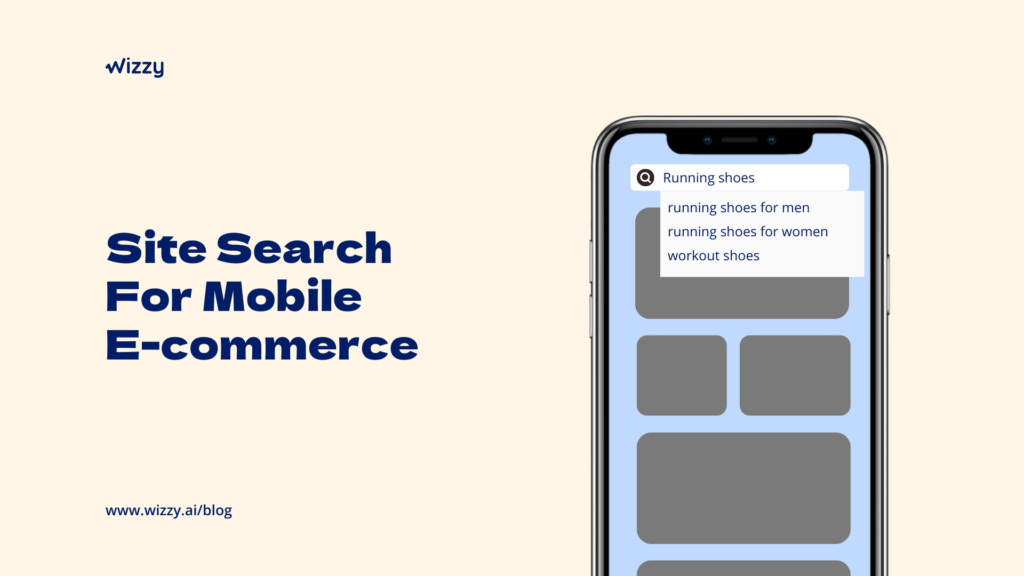
Display Autocomplete Suggestions
The autocomplete option can be based on your site’s content and keywords or based on the searcher’s location and previous searches.
When you use the AI-based search features, you can intelligently display search results within just a few milliseconds of typing a couple of letters based on the keyword intent.
Or you can use the device’s previous searches or location data collected to show relevant results — which can be especially helpful if you’re trying to sell something that might have multiple options (such as clothing sizes).
Include Search Filters
According to a study by Baymard, 50% of the users tried to search within a product category to filter the search results. Unfortunately, 94% of them-sites don’t have this feature.
Since you can only display most of 4 to 10 items on a mobile device, shoppers can get easily frustrated when they don’t see the product they need within the first few scrolls. But with the search filters, users can dial down their search based on a product category, colors, prices or any other filter to get more relevant results.
Provide Instant Search Results
Mobile search is all about speed and convenience. It’s no secret that most mobile users are impatient, so they’ll abandon your site if it doesn’t load quickly enough or if the information they need isn’t readily available. That’s why it’s so important to deliver the best possible mobile search experiences.
When your search takes a long time to load, it can dissatisfy the impatient users and create a first bad impression. So make sure to keep your search loading for not more than a second. You can use intelligent search options like lazy loading or displaying the first few product names based on the search terms to keep the users occupied while the rest of the search results load.
Even if you have enabled visual search, you can display the first few search results with the pictures and load the rest of them in the next second. This way, you can provide instant search results that fit into the small screen of the mobile phone and give more options as the user scrolls down.
Offer Alternatives Instead of ‘No Results’
Every interaction is an opportunity to convert the shopper into a customer. So even when there’s no match for the search term, don’t leave the shoppers hanging with a blank ‘no results’ page.
Instead, you can provide alternate products, something similar to what the person was typing in. For example, if you don’t have ‘fluorescent block heels,’ you can instead show block heels in alternate colors.
And there may be times when a user has misspelled a word and the site returns a ‘no results’ page. It can frustrate the users and create a false impression of the unavailability of your product when it’s right within your niche!
This is when having an optimized site search functionality helps.
Wizzy – Intelligent Site Search for Mobile Sites & Apps
Wizzy is an AI-based site search tool with contextual search options — which means it displays the results based on the intent of the user, even when the user has misspelled the words or has used synonymous terms.
Wizzy works seamlessly on both mobile phones and desktops and comes with an autocomplete search feature that continuously learns from your shoppers’ behaviors with an easy-to-use filter that helps the shoppers quickly find what they need.
Wizzy directly optimizes your mobile search functionality, so you don’t have to worry about long loading times or irrelevant searches driving your customers away.
Reach out to our team today to schedule a demo.

Share this article
Help others discover this content